
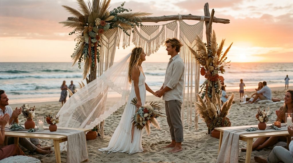
How to choose boho wedding colors that don’t clash in photos was the question I wrestled with after my cousin’s ceremony looked gorgeous in person but flat in the album.
You’ll learn a simple rule set, three go-to palettes that photograph well, and affordable pieces to test—plan for core décor between $500–$1,500.
The vibe here is boho coastal: relaxed, textured, slightly sun-faded, not glossy.
This approach suits intimate elopements, small beach micro-weddings, and destination ceremonies where packing light and resisting blowout highlights matter.
Lately I’ve seen couples favor dried florals, sunset-inspired tones, and sustainable linens over glossy white arches.
1. Set the Scene: Ceremony Arch and Aisle Styling
Pick a neutral anchor first. Driftwood, raw timber, or a muted rattan arch gives you a color baseline that never competes with skin tones.
Then choose two accents max: one warm (terracotta, rust, warm clay) and one cool (dusty blue, seafoam, sage). That three-note rule keeps photos readable.
Avoid pure bright white for the arch drape. In midday sun it “blows out” and steals contrast. I used an ivory linen instead of white and it saved the highlights without looking yellow.
Practical: dye a small swatch of linen if you need a custom shade. A local seamstress can do it for $20–$40.
Suggested palettes that consistently photograph well:
- Sand + Terracotta + Dusty Blue
- Oatmeal + Sage + Blush
- Driftwood + Mauve + Seafoam
2. Layer Texture With Coastal Table Décor
Texture reads better on camera than pattern. Think raw linen runners, macramé accents, rattan chargers, and matte stoneware.
I bought a macramé runner and mix-matched ceramic plates from Amazon and Etsy; the runner hid table glare and photos looked warm and tactile. (Search macrame table runner: https://www.amazon.com/s?k=macrame+table+runner&tag=theoceanvows)
Keep table linens in oatmeal, mushroom, or clay. Use napkins in your accent color—one napkin color ties each place setting together.
Flatware and glassware: brass or champagne-toned metals warm up terracotta palettes. Clear crystal can clash if your palette is dusty; choose smoked glass for moody boho.
Budget tip: linen napkin sets from West Elm or Etsy run ~$3–$8 per napkin. Mix thrifted brass candlesticks with a new runner to save money.
3. Dress For Sand And Wind: Bridal Look Essentials
The trick is fabric and tone, not just the dress shape. Off-white and ivory photograph better than stark white on sand.
Ugly truth: heavy sequins reflect the sun and create hotspots in photos. Choose matte or softly beaded gowns.
Ugly truth: big glam veils look dreamy until the wind turns them into a tangled mess. Test veil weight in a beach breeze.
Bridesmaids: I recommend tonal variation—different dresses in the same family (sage in varying depths, or blush/dusty rose mix). It looks purposeful, not matchy-matchy.
Groom: unstructured linen suits in light sand, dove gray, or soft tan photograph better than navy on the beach. Skip pure black—it absorbs heat and loses detail in photos.
Hair + makeup: warm, dewy tones that match the palette. Ask your MUA to bring a tiny sample card of lip colors to compare with bouquet photos.
4. Finish With Florals, Favors, And Final Details
Dried flowers and pampas give boho texture and survive humidity. Pair them with one fresh bloom (a single peony or anemone dyed to your accent color) for life in photos.
Stationery: kraft paper or uncoated cotton stock with muted ink (terracotta, charcoal, or sage) reads well in photos instead of bright black.
Favours and signage: use amber jars, wooden tokens, or shells. They echo the natural palette and don’t create jarring reflections.
Vendor picks I’ve used: Afloral for dried pampas ($25–$50 per bundle), Etsy for custom linen napkins (~$3 each), and BHLDN for bridesmaid dress inspiration.
5. Build And Test A Photo-Friendly Palette Board
This is the secret that saved my cousin’s album: make a palette board and photograph it in the actual light at the venue.
Pin fabric swatches, flowers, ribbon, and a printed invite to a foam board. Take photos at the ceremony hour and at golden hour.
If a color disappears or clashes on camera, replace it. Repeat until the board reads like your photos, not like a mood board.
Another test: take a quick phone portrait of someone wearing the key colors. Skin tones will reveal whether a shade flatters or fights with natural light.
Common Mistakes That Ruin Photos
- Using pure white as your main color (blows out highlights).
- Choosing neon or ultra-saturated hues (make skin look off).
- Overloading with patterns—visual clutter in group shots.
- Buying everything “matchy” instead of tonal layering.
Wrap-up: pick one neutral anchor, two accents, and prioritize texture over pattern. Test your palette on-site and photograph the board at ceremony hour.
If you want, tell me three colors you’re drawn to and I’ll map them into a photographer-friendly boho palette. And if you want a quick shopping link for macramé runners or linen napkins, try this Amazon search with my tag: https://www.amazon.com/s?k=macrame+table+runner&tag=theoceanvows —happy planning.