How to choose beach wedding colors was the question I fumbled through at my cousin’s shoreline ceremony. I wanted something fresh, not the usual washed-out blues and cliché nautical stripes.
You’ll learn a simple color formula, exact shades that photograph well at golden hour, and a realistic budget (expect $500–$1,500 for core décor). I’ll also point you to a short Amazon picks list I use: https://www.amazon.com/shop/theoceanvows.
The vibe here suits barefoot luxury, intimate elopements, and micro-weddings. Think sun-bleached linens, textured driftwood, and a small pop of color rather than a full-on tropical palette.
Lately I’ve noticed couples moving away from stark white and toward muted, sandy tones with one anchor color. That keeps things elegant in wind and sun.
1. Set the Scene: Ceremony Arch and Aisle Styling
Result: A ceremony that reads coastal, not costume-y.
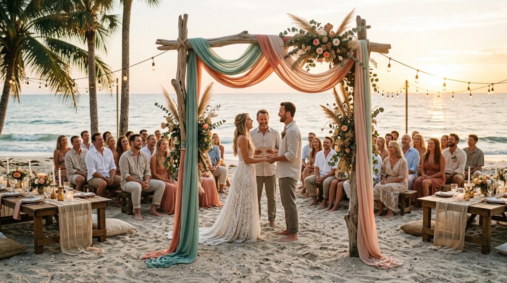
Pick a neutral base for your arch: sun-bleached linen (#E9E2D0) or driftwood gray (#B8B1A8). Those hold up under direct sun and photograph with warmth. Anchor that neutral with one accent — kelp green (#8AA29E) or coral blush (#FF7F7F). I used kelp leaves tucked into a driftwood arch and it read modern, not beach tacky.
Tip: avoid pure white fabric. It blows out in photos at noon and looks like a tent. Instead, ask vendors for “antique white” or “warm linen.”
Size/detail: a 9–10 ft arch is ideal for groups 40 or fewer. I rented a driftwood arch from a local prop house for $150 and tied 3 yards of linen on each side — enough for movement but not a billowy mess.
2. Layer Texture with Coastal Table Décor
Result: Tables that feel tactile and weather-proof.
Start with a neutral runner (sun-bleached linen) and add a narrow strip of color down the center — seafoam (#BFD8C6) or storm blue (#4F6D7A) for contrast. I paired Crate & Barrel linen napkins (~$6 each) in seafoam with wooden chargers from an Etsy seller for a natural base.
Centerpieces: low and dense. Tall arrangements topple in wind. Use succulents, kelp greenery, and a single bloom in the anchor color (one coral peony or protea). Weight votives — West Elm glass votives (~$12) inside small hurricane jars to keep candles lit.
Practical: clip napkins with brass napkin rings or small shells with removable adhesives so nothing flies into the surf. I bought weighted napkin clips from Amazon (see my shop) and they saved the day.
3. Dress for Sand and Wind: Bridal Look Essentials
Result: Photos that flatter and fabrics that survive the elements.
Choose breathable fabrics: chiffon, crepe, lightweight silk. Heavy satin screams “ballroom” on a beach. For bridesmaids, skip matching colors — pick a palette. I had three bridesmaids in seafoam, sand, and storm blue dresses; it looked curated without being uniform.
Groom: linen suit in driftwood gray or a soft tan. Tie in the accent color with a pocket square or boutonnière, not the whole suit.
Ugly truth: white trains drag sand and look filthy after the second step. Bring a short detachable train or plan a barefoot moment for photos. I packed a $18 crochet shawl from Amazon for quick coverage during portraits.
4. Finish with Florals, Favors, and Final Details
Result: Cohesion that guests notice in small touches.
Florals: pair muted greenery with one saturated bloom — coral or deep apricot works beautifully against seafoam. Avoid 15 different flower colors. It reads busy from a distance.
Favors: shell place cards are charming. I found mine at a coastal home shop during a summer sale. Another reliable option: locally made sea-salt jars with a seafoam label — they travel well.
Lighting & signage: dusk is the hero. Use warm string lights and lanterns in the anchor shade (painted bases or colored glass). Signage in driftwood gray with white lettering feels clean.
5. Use Contrast: Add an Anchor Color That Grounds Everything
Result: A palette that’s photographed, not faded.
Pick two neutrals and one anchor. Example: sun-bleached linen + driftwood gray + coral blush. Or sand + seafoam + storm blue. The trick is contrast: neutrals set the mood; the anchor directs the eye.
Hex cheat sheet I used:
- Sun-Bleached Linen: #E9E2D0
- Seafoam: #BFD8C6
- Driftwood Gray: #B8B1A8
- Coral Blush: #FF7F7F
- Storm Blue: #4F6D7A
Use the anchor in small doses — napkins, a single floral type, ribbon on programs — not on every surface.
Ugly truths (you asked for honesty)
- Pastels vanish at high noon. They photograph as washed-out blobs.
- Too many colors feel cheap. Less is more on a beach that already has visual noise.
- Lightweight fabrics billow into ridiculous shapes. Wind is not romantic at 20 mph.
Quick shopping guide (real picks)
- Weighted napkin rings and sand anchors — my Amazon shop: https://www.amazon.com/shop/theoceanvows
- Linen napkins: Crate & Barrel (~$6 each)
- Glass votives: West Elm (~$12 each)
- Driftwood arch rental: local prop houses, $100–$300 depending on distance
Wrap-up
If you remember one thing: anchor with a neutral pair and one confident color. It looks deliberate in-person and on camera. Start with fabric and texture decisions first, then let color accents pop in florals and small details.
Want my curated list of exact products I used (links and rough prices)? Check my Amazon shop: https://www.amazon.com/shop/theoceanvows. If you want, tell me your venue photo and I’ll suggest a two-neutral + anchor combo that will work at that light time.