
My cousin taught me how to choose beach wedding colors the hard way: we spent $400 on pastel linens that vanished at sunset. The result? Photos looked flat. Guests kept saying, “Where did the colors go?”
You’ll learn which hues actually read on sand and in photos, what to avoid, and a simple, budget-friendly palette you can test the week before. Plan for a $500–$1,500 core décor budget if you’re DIYing small details.
This is for barefoot luxury elopements and intimate micro-weddings — or destination couples who want colors that survive wind, salt, and that thirty-minute golden-hour sprint photographers love. Lately I’ve noticed couples leaning into saturated accent tones instead of all-pastel palettes. It reads better at dusk.
1. Set the Scene: Ceremony Arch and Aisle Styling
Start with contrast. The arch is your anchor in photos. If your backdrop is sky and sea, pale linens disappear at sunset.
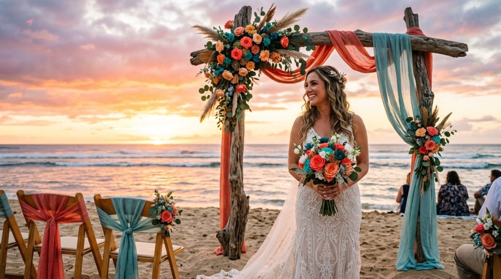
I chose a weathered driftwood arch and layered a deep coral runner (not pastel coral — think terracotta-coral). It popped against the water, even as the light warmed.
Ugly truth: pure white arches blow out in photos at sunset. They reflect too much light. Instead, pick warm ivories, baked whites, or natural wood.
Bring swatches. Tape them to the arch or over a chair and watch them as the sun dips. If you can, take a phone photo at the time your ceremony will happen. That quick test tells you more than mood boards.
Vendors I used: an Etsy builder for the driftwood arch, linen runners from Amazon (affiliate: theoceanvows) for budget-friendly colors, and local rope accents from a coastal hardware store.
2. Layer Texture with Coastal Table Décor
Tables need depth so colors read in changing light. Combine a neutral base with one saturated accent and one metallic or natural tone.
Example: sand-colored tablecloth, sea-glass napkins, and a single pop of deep teal or warm coral in a runner or charger. That one saturated color keeps photos from washing out.
Ugly truth: pastels blend with sand and look muddy by sunset. Another ugly truth: shiny metals can reflect glare and produce hotspots in photos.
Textural tricks: jute runners, ruffled gauze napkins, matte ceramic chargers from Pottery Barn or Anthropologie, and blown glass votives. I bought sea-glass napkin rings at a coastal home décor shop during a summer sale — $12 for six — and they anchored the palette beautifully.
Tip: Choose table linens in 100% linen or gauze — they take dye deeply and keep saturation without looking flat.
3. Dress for Sand and Wind: Bridal Look Essentials
Wedding white is tricky at the beach. If your dress is bright white and your bridesmaids are in pastels, everything can wash to the same level at sunset.
I opted for a warm-ivory gown and asked bridesmaids to wear mismatched deep teal and terracotta pieces. The result: each person read distinctly in photos.
Ugly truth: light fabrics can become translucent in bright, slanted sun. Plan with proper underlayers and test in beach light.
Groom tip: swap a stark white shirt for an ivory or soft blue option. It’s subtle, but it prevents the groom from disappearing against the sand.
Shoes and accessories: choose leather tones, woven sandals, or barefoot sandals in bronze or gold. They reflect the sunset softly without creating glare.
4. Finish with Florals, Favors, and Final Details
Florals are where your accent palette truly sings. Pick flowers in saturated tones that keep pigment after a few hours on the sand.
I asked for coral peonies (or coral-colored garden roses) mixed with blue thistle or preserved sea lavender. The coral held color through the reception; the blue provided cool contrast.
Ugly truth: delicate blooms droop in salt air. Use sturdy varieties and add hydration picks. Consider a few preserved elements (dried palms, seagrass) for texture that won’t wilt.
Stationery and signage: avoid faint watercolors. Print invites and signs with deep inks — navy, charcoal, or a warm bronze. For place cards, shell cards are charming but can be hard to write on; I found shell place cards at a coastal shop and used waterproof pens.
Final detail: lighting. Low, warm LED uplights and brass or glass votives keep your palette true after sunset. Candles with glass protectors survive the wind and give that warm glow.
5. The Quick Test: How To Know Before You Commit
Three-step sunset-proof test I use every time:
- Gather your fabric swatches, a sample bouquet, and a printed invite.
- Take them to the beach an hour before your ceremony time.
- Photograph them together on your phone at 20 minutes before sunset and again 10 minutes after. Compare.
If the colors still read as distinct and not muddy in those photos, you’re safe.
Bonus: bring a backup accent — a folded deep ribbon or extra napkin — in case the actual color reads differently on the day.
Conclusion: keep contrast, texture, and one saturated accent as your rules. Avoid pure white and pastel-heavy palettes unless you plan heavy lighting. Test on location. And if you need affordable linens or quick swatches, I’ve used Amazon (affiliate: theoceanvows) for fast color samples and replacements. Small tests save big money and better photos.
If you want, tell me your venue and your favorite two colors and I’ll sketch a sunset-proof palette you can test next weekend.