Summer wedding colors have been weirdly predictable lately, so I pulled 12 palettes that feel fresh without screaming “Pinterest redo.” Summer wedding colors are all about balance, and this list ranges from tiny splurges to under $50 accents. I planned a sunset rehearsal dinner that used two of these palettes and watched guests actually remember the colors the next day. Expect breathability, not bravado.
Most palettes below work for micro to 150-guest beach weddings. Most accessory pieces are under $40, a few splurges sit around $150. These suit boho, coastal chic, tropical, and barefoot ceremonies. I’ve noticed couples leaning toward tonal layering and warm neutrals going into 2025, with a side of saturated accents.
1. Soft Coral, Sage, and Warm Sand
Style: Boho Coastal | Budget: Under $60 | Best For: Golden-hour ceremonies
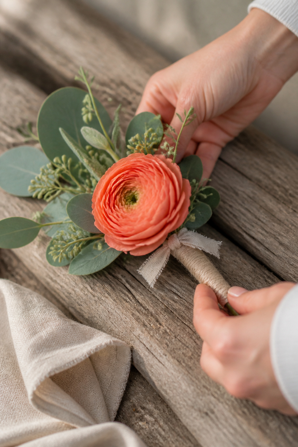
This palette reads sun-kissed and grounded. The trick is using coral as a punctuation color, not the headline. I used a coral bloom cluster on one table and sage runners across all tables to tie the look together. Wind-proof corsages with floral-tape stems held up better than loose wraps. I linked a compact coral boutonniere option for quick vendor refills at about $12 to $25 per stem. Guests complimented the color combo during cocktail hour; it photographed warm without oversaturating skin tones.
Shop this idea:
2. Blush, Champagne, and Driftwood Gray
Style: Classic Coastal | Budget: Under $80 | Best For: Timeless receptions
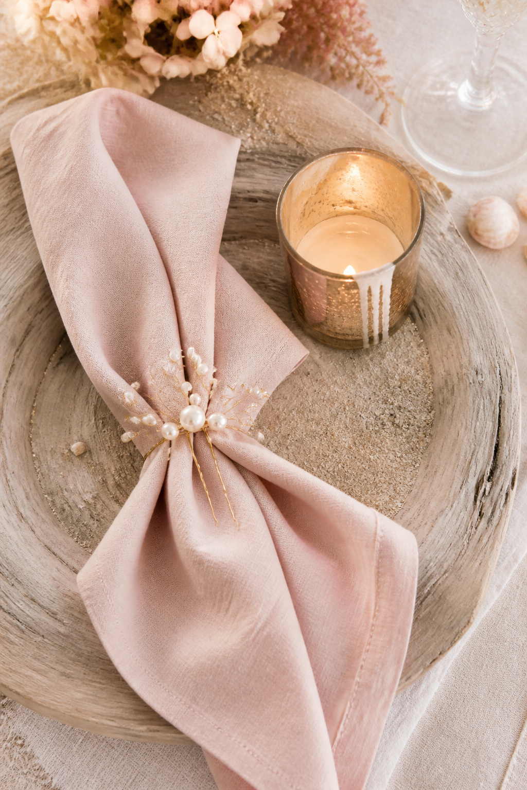
This is my fallback when couples want soft, polished summer wedding colors. Champagne metallics add warmth but test finishes near salt air; brass can patina fast if left unsealed. I recommend sealed brass votives that run around $30 to $70 each for centerpieces. When we used a driftwood gray runner, the photos stayed neutral instead of going flat, which fixed the ugly truth that blush-on-blush can vanish in bright sun.
Shop this idea:
3. Sunlit Lemon, Navy, and White
Style: Bold & Nautical | Budget: Under $70 | Best For: Daytime beach picnics
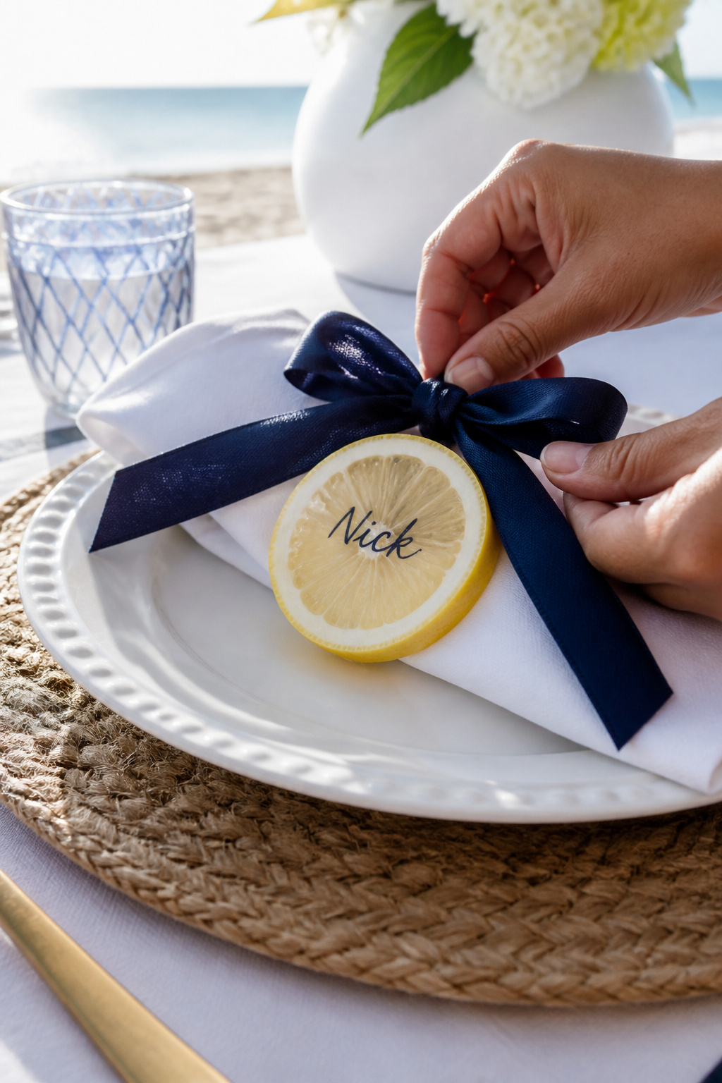
This palette pops without feeling gimmicky when you let navy ground the lemon. The ugly truth is bright yellows can look neon in midday sun; keep lemons as accents and use navy linens to prevent glare. I picked a navy ribbon-wrapped place setting that cost about $1.50 to $3 per place. Tip: tuck a single preserved lemon slice on each napkin for smell and texture, but test for stickiness in heat.
Shop this idea:
4. Terracotta, Olive, and Cream
Style: Moody & Golden | Budget: $40 to $120 | Best For: Sunset boho tables
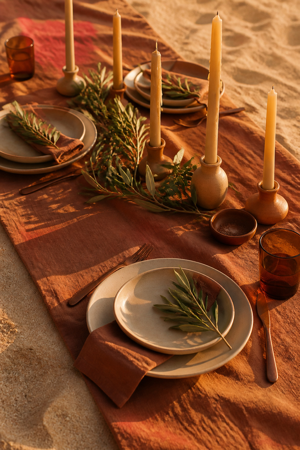
Terracotta reads like summer earth. The trick is pairing it with olive so the palette stays tonal. I once saw a terracotta runner clash with bright fuchsia florals; the lesson is keep florals muted here. For candles, use beeswax tapers that run around $8 to $20 each so they hold color under wind. Guests loved the grounded feeling, and the palette worked into groom’s jacket accents without feeling forced.
Shop this idea:
5. Coral Pink, Teal, and Pearl
Style: Bold & Saturated | Budget: $50 to $150 | Best For: Tropical receptions
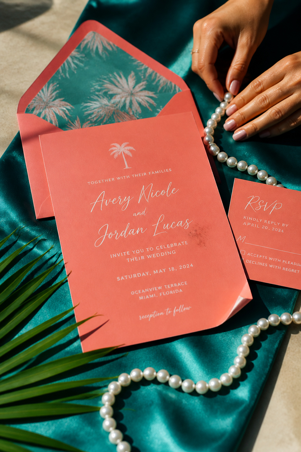
This is for couples who want summer wedding colors with real pop. Avoid overloading coral across everything; it competes with skin tones. I recommend using coral in stationery and one floral focal, keeping teal as the supporting field color. I linked an insulated teal runner option for about $25 to $45 that stood up to damp sea breezes. Ugly truth: bold palettes demand careful photo tests, or skin tones can skew.
Shop this idea:
6. Sea Glass Green, Soft Aqua, and Linen
Style: Bright & Airy | Budget: Under $50 | Best For: Micro and elopements
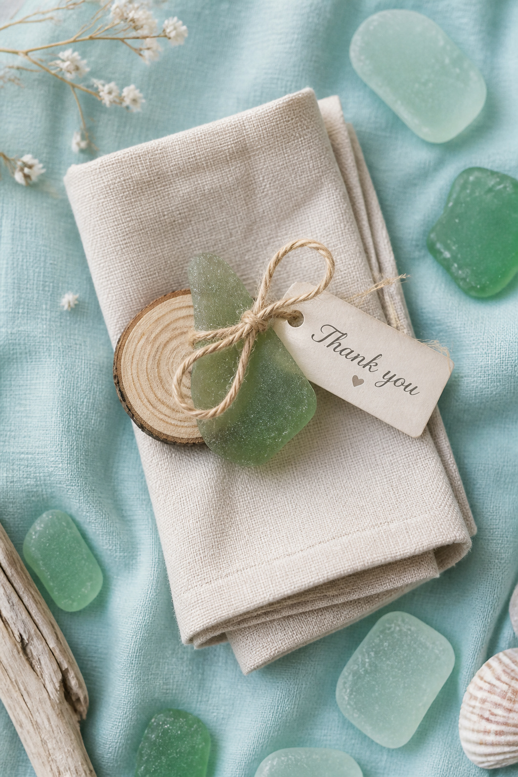
Sea glass tones give an instant coastal feel without shouting. The practical tip is to keep table linens textured linen instead of bright white; linen hides sand and looks intentional. I sourced sea glass favor bags for roughly $3 to $7 each during a wholesale run. Ugly truth: faux sea glass can look plastic in photos, so choose matte finishes or real tumbled glass where possible.
Shop this idea:
7. Lemon Verbena, Soft Gray, and Ivory
Style: Elevated Minimalist | Budget: Under $40 | Best For: Small barefoot ceremonies
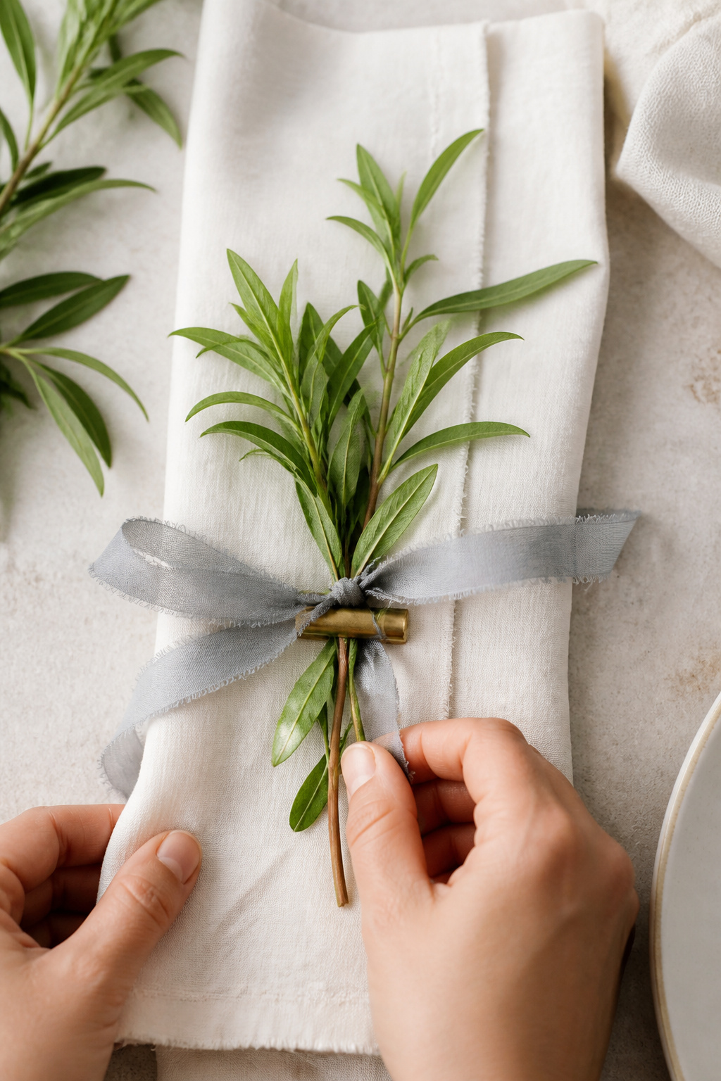
This palette reads fresh and curated. I love lemon verbena tucked into napkins; it smells good and photographs soft. The ugly truth is fresh herbs wilt in direct sun within an hour, so prep favors and napkin sprigs last-minute. I linked a soft gray ribbon pack you can use for about $8 to $20 so you can tie dozens quickly with a heat-sealed edge.
Shop this idea:
8. Coral Reef, Sunset Orange, and Sand
Style: Moody & Golden | Budget: $30 to $100 | Best For: Sunset vows
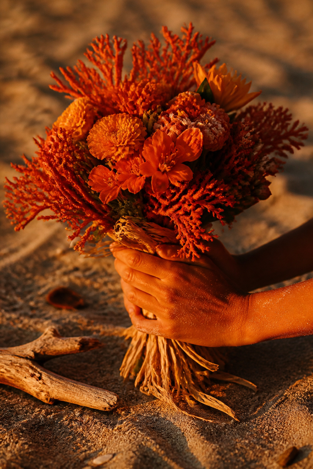
This palette thrives at golden hour. The practical tip is schedule portraits 30 minutes before sunset so the palette blooms on camera. I once saw harsh noon light flatten these tones, which is the ugly truth: timing matters more than extra florals. I linked a coral boutonnieres kit for vendors at about $10 to $30 per pack for quick touch-ups.
Shop this idea:
9. Deep Turquoise, Coral Accent, and Sun-Kissed Gold
Style: Bold & Tropical | Budget: $60 to $150 | Best For: Destination weddings
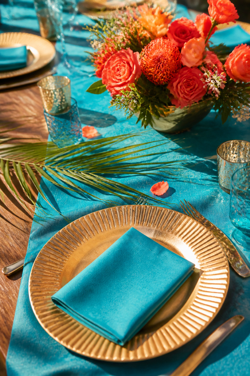
Deep turquoise anchors tropical energy. The trick is keeping gold finishes matte near salt air; polished gold oxidizes. I recommend matte gold chargers at around $6 to $20 each for a durable look. Ugly truth: heavy saturation can make groomsmen suits look odd in mixed lighting, so test fabric swatches together before ordering.
Shop this idea:
10. Pale Peach, Oyster Shell, and Moss
Style: Soft Organic | Budget: Under $70 | Best For: Intimate brunches
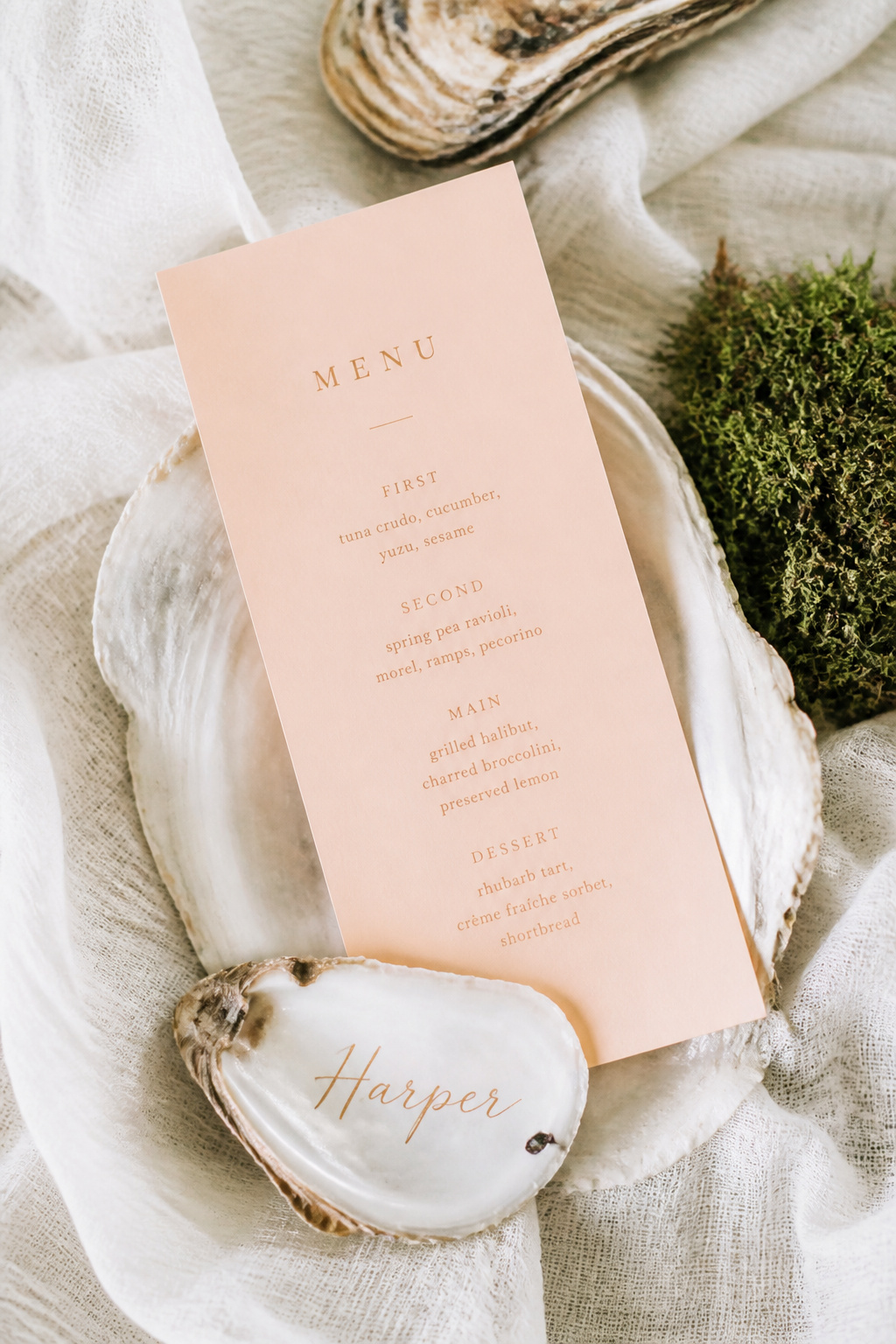
This combo feels natural and slightly coastal. Use oyster shells as place cards but be honest: shells can chip and are awkward to stack in transport. I kept the peach as a paper element and used moss bundles as low-cost centerpieces that ran around $6 to $15 each. Guests loved the tactile details; a vendor told me shells are beautiful until the last table needs more.
Shop this idea:
11. Denim Blue, Blush Rose, and Driftwood Brown
Style: Casual Tailored | Budget: Under $80 | Best For: Groom-focused accents
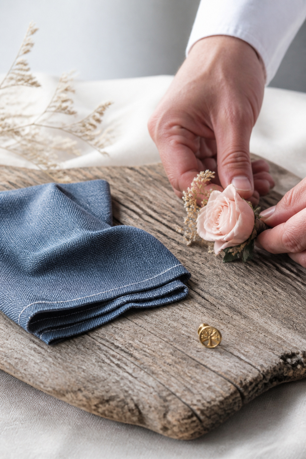
Denim blue is great for groomsmen without going matchy-matchy. The ugly truth is denim tones can read flat against sky backgrounds in photos; add blush or brass accents to create depth. I linked a denim pocket square pack for about $6 to $15 each that layered well with brass lapel pins. Practical note: secure boutonnieres with both pins and twine for windier beaches.
Shop this idea:
12. Mint, Champagne, and Shell White
Style: Bright & Airy | Budget: Under $60 | Best For: Daytime ceremonies and receptions
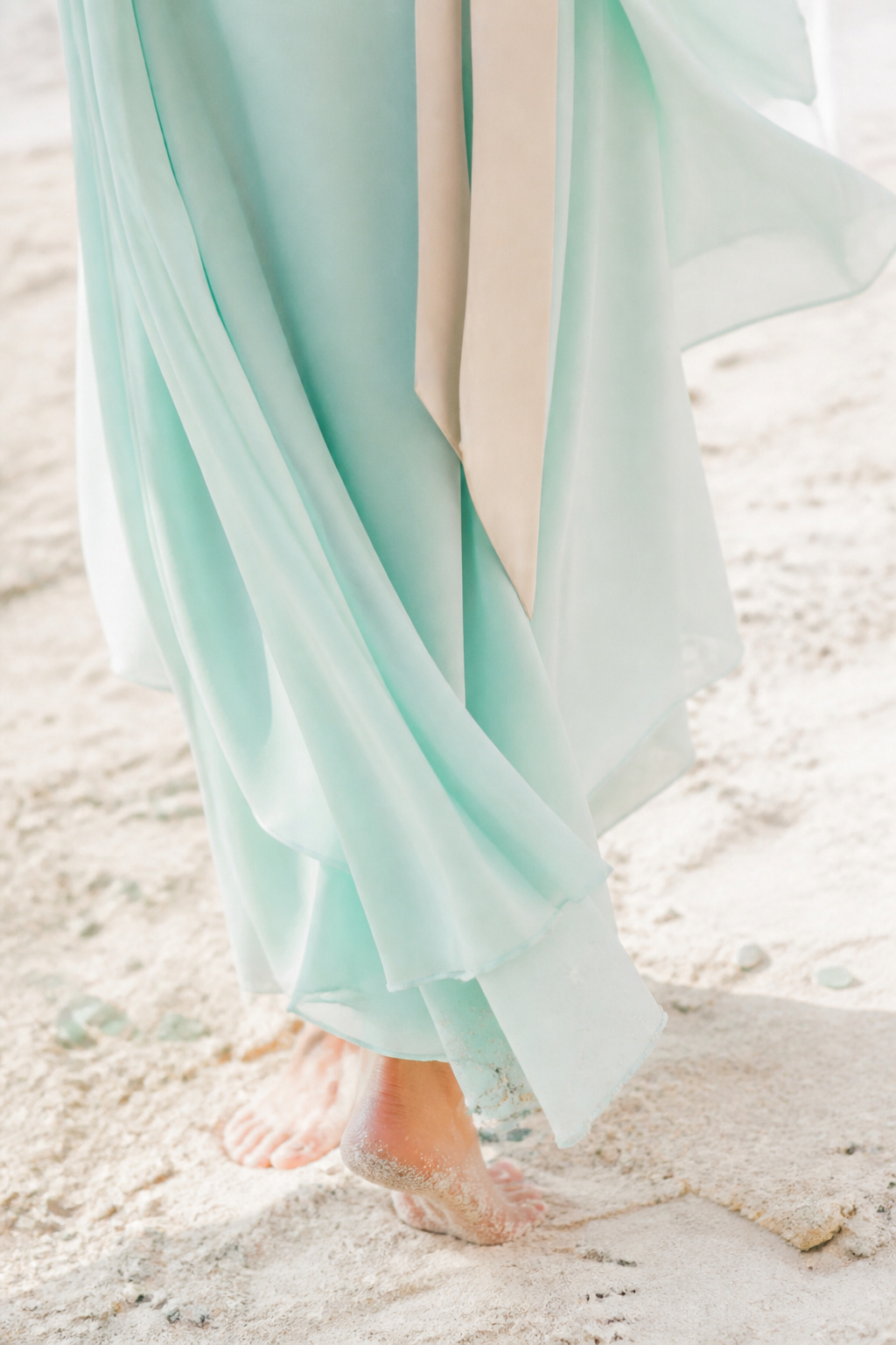
Mint and champagne feel classic for daytime nuptials. The trick is fabric choice; chiffon reads thin in harsh sun and can appear semi-transparent. I recommend lining or heavier chiffon for about $20 to $60 per dress to avoid surprise see-through moments. I spotted this palette at a Malibu micro-wedding and a guest later told me the mint dresses matched the ocean without competing with the vows.
Shop this idea:
What You'll Need to Pull This Off
Ceremony Décor Essentials
- Pampas grass arch kit natural ivory around $28 to $55
- Bleached linen aisle runner 2ftx30ft around $35 to $120
- Brass ceremony lantern large around $40 to $100
- Wooden driftwood signage 18×24 around $25 to $80
Reception Styling & Tableware
- Matte gold charger plates around $6 to $20 each
- Linen table runner natural 10ft around $18 to $45
- Glass sea votive set 4pc around $12 to $35
Bridal & Bridal Party Attire
- Mint chiffon bridesmaid fabric yard around $8 to $25 per yard
- Bridal pearl hair pins set around $10 to $30
- Denim pocket square set around $6 to $15 each
Lighting, Favors & Finishing Touches
- Brass votive hurricane small around $30 to $70
- Sea glass favor bottles bulk around $3 to $7 each
- Solar string lights warm white around $20 to $60
Budget Swaps
- Faux floral foam wreath around $8 to $20 (swap for fresh florals)
- Polyester runners discount around $10 to $25 (swap for linen)
- Faux pampas grass stems around $12 to $35 (swap for rented installations)
Planning Tips for Your Beach Wedding
Check Tide Windows: Book your ceremony time with tide data and a permit. Use a state tide chart and plan photos 20 to 40 minutes before sunset. Tide planning guide
Wind-Proof Your Florals: Use wired stems and floral tape under wraps. Buy floral tape and stainless pins in bulk for backups. Floral tape bulk
Test Color Outdoors: Bring fabric swatches to the beach at ceremony time. Natural light will show if a hue reads washed out or neon. Fabric swatch pack
Mix Rented & Amazon Finds: Rent large pieces like arches, buy table linens and place settings from Amazon for a budget mix. Arch rental alternative
Embrace 2025 Trends: Layered tonal palettes and heritage neutrals are growing in 2025. Lean into texture rather than more colors for modernity. Textured linen runners
Frequently Asked Questions
Q: How do I prevent colors from washing out in bright sun?
A: Pick one grounding color like navy or driftwood gray and use brighter tones as accents. Test a small table outdoors during midday. Consider matte finishes over glossy for tableware. Matte plate set
Q: Are metallics okay near the ocean?
A: Yes, but choose sealed or matte finishes to avoid rapid tarnish from salt air. Bring a small polishing cloth and a backup set. Polishing cloths pack
Q: What color palettes photograph best at sunset?
A: Warm terracotta, coral, and gold tones complement sunset light and deepen without overpowering skin tones. Schedule portraits 20 to 40 minutes before sunset. Terracotta napkin pack
Q: How many colors should my wedding palette have?
A: Aim for 3 to 4 core colors: a base neutral, a mid tone, an accent, and a metallic or texture. This keeps cohesion across décor, attire, and stationery. Color swatch cards
Conclusion
Start small, with one reliable element like napkins or runners, then layer another color in florals or stationery. My go-to closing tip is always to photograph a mock table at the exact ceremony time; it spots problems no moodboard will. Which palette caught your eye and why?