How to style wedding entrance signs so the setup feels intentional was the first thing I worried about at my sister’s beach ceremony.
We’d spent $300 on a gorgeous acrylic welcome sign, and it looked like a random lawn sale propped in sand. I learned fast how small choices—scale, anchor, and pairing—turn a sign into a scene. In this guide I’ll show what to buy (even budget-friendly picks), what to avoid, and how to make your entrance sing on a $200–$1,500 décor budget.
This suits intimate elopements, micro-weddings, and destination ceremonies where every detail needs to read from a distance. Lately I’ve seen couples favor driftwood frames and sustainable rentals over painted arches — it looks lived-in and survives wind better.
1. Set the Scene: Ceremony Arch and Aisle Styling
Think of the entrance sign as the headline to your ceremony stage. It should read in one glance and point guests toward the aisle.
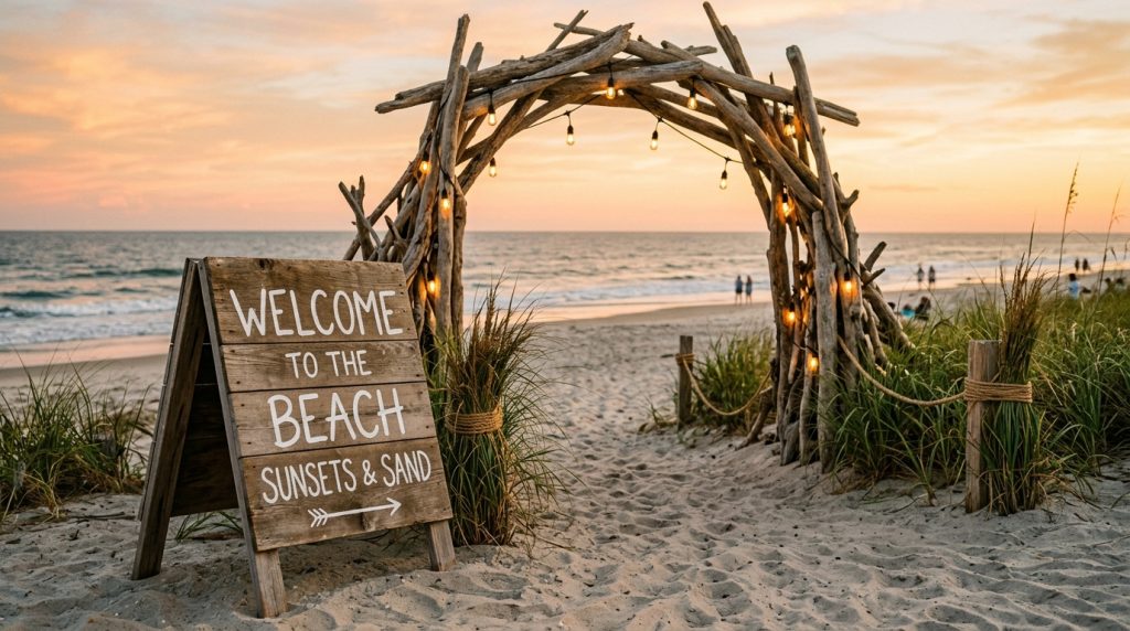
Place the sign off-center, about 6–10 feet in front of the arch. That creates a visual runway and prevents guests from crowding the ceremony backdrop. For small signs (18×24″), put them on a low easel; for big ones (24×36″ acrylic or wood), use a weighted A-frame.
Ugly truth: tall, thin signs topple in coastal gusts. Counter that with 20–30 lb sandbags behind your easel or use stainless-steel ground spikes driven into packed sand.
Styling beats: frame the sign with two low bundles of pampas grass or a pair of lanterns — symmetry reads intentional. I bought sun-bleached driftwood branches from a local vendor and tied them to the easel with jute for texture. It cost $35 and made the sign feel custom.
2. Make the Entrance Sign Look Deliberate: Scale, Placement, Pairing
Scale is everything. Too-small signs vanish; too-large signs block sightlines.
A good rule: signage should be roughly one-quarter to one-third the width of the arch behind it. On a 6–8 ft arch, aim for a 24×36 or 30×40 piece. Fonts should be legible at 10–15 feet—think bold serif or simple script, 60–90 pt for names.
Pairing is what sells the setup. Match materials: an acrylic welcome sign pairs with sea glass votives and brass candleholders; a reclaimed-wood sign wants rope, linen, and driftwood props.
Ugly truth: pretty fonts on Instagram often fail in real light. High-contrast colors read better—dark navy on frosted acrylic beats thin white script on clear acrylic every time.
I used an acrylic 24×36 welcome sign from Amazon (affiliate tag: theoceanvows) and layered it over a low wooden crate. The reflection of the sunset made the lettering glow.
3. Layer Texture with Coastal Table Décor
Your welcome table is part of the entrance story.
Use a low table (around 30″ wide) draped in slubby linen in sand or oyster shades. Add one sign for directions and another smaller piece for the guest book or welcome note. Anchor everything with trays of shells, a handful of sea glass, and a heat-proof lantern.
Keep clutter to a minimum. One focal sign + two textural elements = curated. I found a set of brass lanterns at West Elm and paid $45 each on sale. They weighed down the table and looked intentional in the breeze.
Ugly truth: paper programs fly like confetti on windy beaches. Either use heavier card stock (120–130 lb) or place programs in baskets with stones and a framed sign reading “Grab one—please hold.”
4. Finish with Florals, Lighting, and Weather-Proofing
Florals anchor signs visually and hide hardware.
Choose low, wind-tolerant stems: dusty miller, succulents, sea oats, and seeded eucalyptus. Keep arrangements low so they don’t block text. Wrap foam in floral tape and conceal it with a swath of burlap or linen.
Lighting makes signs readable at dusk. Battery-powered LED uplights or fairy lights in mason jars work well. I wired battery puck lights behind acrylic signs for a halo effect; batteries lasted the full set.
Weather-proofing essentials: marine-grade gaffer tape, extra sandbags, and a tube of waterproof acrylic sealant for wooden signs. I keep a roll of Command outdoor strips and a kit of stainless-steel screws in my emergency bag.
Ugly truth: salt corrodes brass and fades colors. If you’re renting metal frames, ask vendors about coastal-safe finishes or choose painted aluminum instead.
5. Typography, Wording, and Visibility
Wording sets tone—formal, playful, or breezy.
Popular coastal phrases I’ve seen work: “Salt-Kissed & Married,” “Welcome to our Beginning,” or a simple “Ceremony This Way.” Keep copy to 2–6 words for instant readability.
Use fonts with good x-height and generous spacing. Pair a bold headline font for names with a light sans serif for directions. Print a mock-up, hold it at 10 feet, and test legibility in daylight.
Ugly truth: too many directional arrows make a sign confusing. One clear arrow and one bold word (“This Way”) is better than four tiny lines of copy.
Shopping notes & quick buys
- Acrylic 24×36 sign — great starter size; I bought mine on Amazon (affiliate: theoceanvows).
- 18×24 chalkboard or wooden A-frame — Etsy sellers like TheCoastalCanvas sell custom hand-lettered options for $120–$250.
- Sandbags (20–30 lb) — local hardware store, $8–$12 each.
- Battery puck lights — Amazon, $12–$20 for a 6-pack.
- Driftwood bundles — local markets or Afloral for curated pieces.
Final thoughts
The result you want is confidence, not clutter. Place your sign where it leads the eye, secure it so the ocean breeze can’t ruin it, and pair it with two thoughtful props—not a dozen.
If you want, I can share my printable sign checklist and the exact Amazon items I used (affiliate tag: theoceanvows). Tell me the vibe—boho, minimalist, or nautical—and I’ll tailor the list.